Did you know that mobile usage has officially outpaced desktop usage?
Data from Statcounter indicates that since 2016, there are more mobile users than desktop users — and that number is steadily increasing. It makes sense, too — everywhere you go, people are on their mobile devices.

When it comes to advertising, this means mobile has to be part of your strategy. Without it, you’re missing a huge audience — and you’re not catering to the average user.
However, some
Use Simple, Visible CTAs
The main goal of any mobile ad is to encourage viewers to act, right? Well, in order for that to happen, the user needs to be presented with a simple, clear CTA button. This will be the conversion — driver in your ad, so think about making it prominent via:
- Leveraging whitespace around the button to keep it visually uncluttered
- Using a button color that stands out from the background
- Using button text that encourages action (like “Learn more” or “Buy now”)
- Positioning the CTA button in a central location to attract a viewer’s eye
You can see a great mobile ad example of this in action from Honda, whose ad for their Civic hits the mark on all of these tips:

Zeendo
Don’t Forget Social Media
Social media platforms like Twitter, Facebook, and Instagram all offer mobile advertising opportunities — and that means you should be testing in these spaces to find out if it’s effective for your brand.
One of the great things about these channels is that they automatically scale your ads for all mobile devices. Bonus: You can preview your ads to see what they will look like to mobile users so you can be sure there aren’t any errors or wonky features before these ads go live.
Take this example from Kokosina International: Their mobile Facebook ad is clean, easy to read, and fits perfectly to a mobile screen.
With the advanced metrics these channels provide, you can study your mobile ads on these platforms to perfect your future ads and make them even more effective.
Target a Relevant Demographic
Relevant targeting is just as important on mobile as it is on desktop, but there are additional considerations you’ll need to make about your target demographic, too.
Ask yourself: What does my typical mobile user look like? Is the target persona for a mobile user slightly different than a desktop user? For example: Your average desktop customer might be a female aged
So how do you know who to target with mobile ads? You can study different metrics to answer these questions. Use Google Analytics to take a deep dive into the demographics of your mobile users, and then target your mobile ads based on your average mobile user. This way, you’ll be devoting your ad dollars to the demographic that’s most likely to convert on your mobile ads.
Include a phone number
Mobile users are often looking for a quick way to get more information — and sometimes, making a phone call is the easiest way to do that. If you have a customer support line or a business phone number you share with customers, including this piece of information in your ad makes it that much simpler for a potential customer to get in touch.

Webmarketingpros
If you decide to include a number, be sure you have the bandwidth to field these incoming calls. Otherwise, you’ll be frustrating your customers who are following the instructions you gave in your ad. Ideally, this route is best for stores who have a department dedicated to customer support via phone.
Use Smart Copy and Compelling Images
Your mobile ad should leverage copy and images that resonate with your target audience. Essentially, that means your ads need to make your target customer stop and pause.
So how do you do that?
Use “power words” like “free”, “try”, “learn”, “grow”, and “find.” These words are
You’ll want to test different versions to see which copy and images work best for your unique images. From there, you can spend out your mobile ad budget only on the most effective version.
Provide an Incentive
An easy way to get mobile users to act on your ad is to give them an incentive to do so. Whether it’s free shipping, a coupon code, or a limited time offer, these offers motivate the audience to click through and act on your ad.
Another good reason to use a
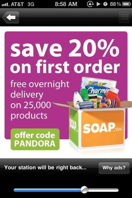
So what does this look like in action? See this mobile ad example from Soap.com. They used this on their mobile ads through Pandora, a music streaming service.
Here, you can see how they’re offering a 20% discount for people who come through this mobile
A/B Test to Find Your Most Effective Version
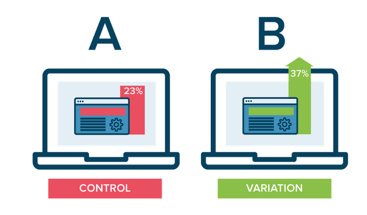
A/B testing different versions of your mobile ads means taking an
With A/B testing, you can test two different elements (as in, A vs. B) of your mobile ads (like copy, images, CTA buttons, etc.) to find which of two different versions is most effective for your desired outcome.
How do you conduct A/B tests on mobile ads? Use tools built for this purpose, such as:
Consider the UI/UX of Your Mobile Ad
User interface and user experience (UI and UX) have big roles in mobile ad development.
On the interface side, you’ll need to consider how the user will actually interact with your
Conducting user testing on these two aspects of your mobile ads will help you create more effective ads that don’t frustrate users. During this process, you should look at how your mobile ads display on a variety of mobile devices, too.
Keep it Lightweight
Slow load times are an easy way to get mobile users to ignore your ads completely. Instead of massive images that take forever to load and elements like Flash that don’t display on all mobile devices, strive to create ads that load quickly and seamlessly for users.
Some mobile ad designers say that if your ad or mobile landing page takes more than five seconds to load, it’s unlikely a user will stick around to act on it.
The bottom line: Keep your ad lightweight so that load speed isn’t an issue.
Less is More
Last, but not least, remember that when it comes to mobile ads — less is more. Rather than trying to fit in tons of copy or images, you should strive for simplicity.
On mobile devices, you’re working with smaller screens, so it’s important to keep the design and conversion path clear, simple, and free from distraction. Add too many different elements to your mobile ad, and your audience will tune the message out completely.
Here’s an example of a simple mobile ad done well from VentureBeat:

Not sure what’s simple enough? Have a focus group review your mobile ad before it goes live so you can gather some initial feedback.
Mobile Ads: Bring New Traffic to Your Store
If you can follow the tips we’ve outlined here, you can attract more mobile users to your store than ever before. That means more traffic, higher sales, and more customers for your growing online business. Learn how to start advertising your store on popular platforms.
Don’t have a mobile store yet? You can add a mobile store in Ecwid in less than five minutes.
- Intro to Advertising: Where to Begin When You’re a Beginner
- 10 Quick Tips For Effective Mobile Ads
- Effective Advertising: How to Calculate Ad Budget
- Google Ads 360: A Comprehensive Guide to Google Advertising
- How to Advertise a Business on Facebook for Beginners
- The Ultimate Guide to TikTok Ads
- Making the Most of Google Shopping Ads
- Run More Effective Ads With Pinterest Tag for Your Ecwid Store


