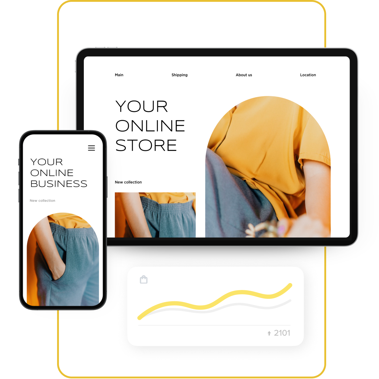
For clothing, beauty products, food, electronics, and many other niches, it’s important to showcase the product in such a way that online customers don’t mind that they cannot see, touch, or try it on, like they are used to doing in physical stores.
You may have already uploaded several quality pictures for each product, but can you go further? Can you stand out with something that is really helpful to your store visitors and possibly turns them into buyers straight away?
Here are a couple of ways to improve visualization, increase customer loyalty, raise the average order value, and personalize the user experience in your store.
Some of the ideas below might require web development, but the majority of them can be implemented by you. All of them will get you into current
1. A Ready-Made Look
Imagine a girl seeing a dress that she likes. Her first thought will probably be, “What can I wear it with?” That thought can lead to her leaving your store
Therefore, it’s smart to offer an outfit that can be bought as one piece or separately.
This also works if you sell jewelry or lifestyle accessories (hipster sketchbooks, retro bicycles, or whatever else).
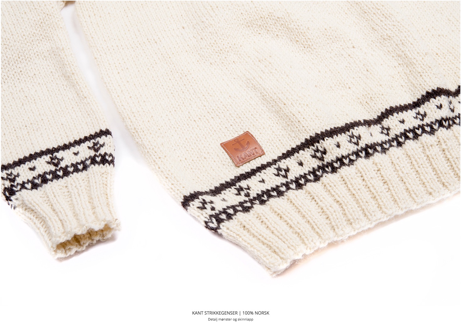

The look by Kant, model: Frode Goa, the store owner
Here’s a related idea for your email marketing:
- Create a welcome email with a questionnaire about your customer’s size, body type, and preferred style.
- Send a monthly collection of outfits that match those answers. You can create several
ready-made email chains, and update them with products to save time and effort.
Related: How to Send Trigger Emails That Keep Customers Coming Back
2. 360° Product Pictures
Another way to make your storefront stand out is to replace flat product pictures with
It’ll be harder to create such pictures for large products, but if you sell digital gadgets, accessories, car parts, and other
See how great
3. Animated GIFs
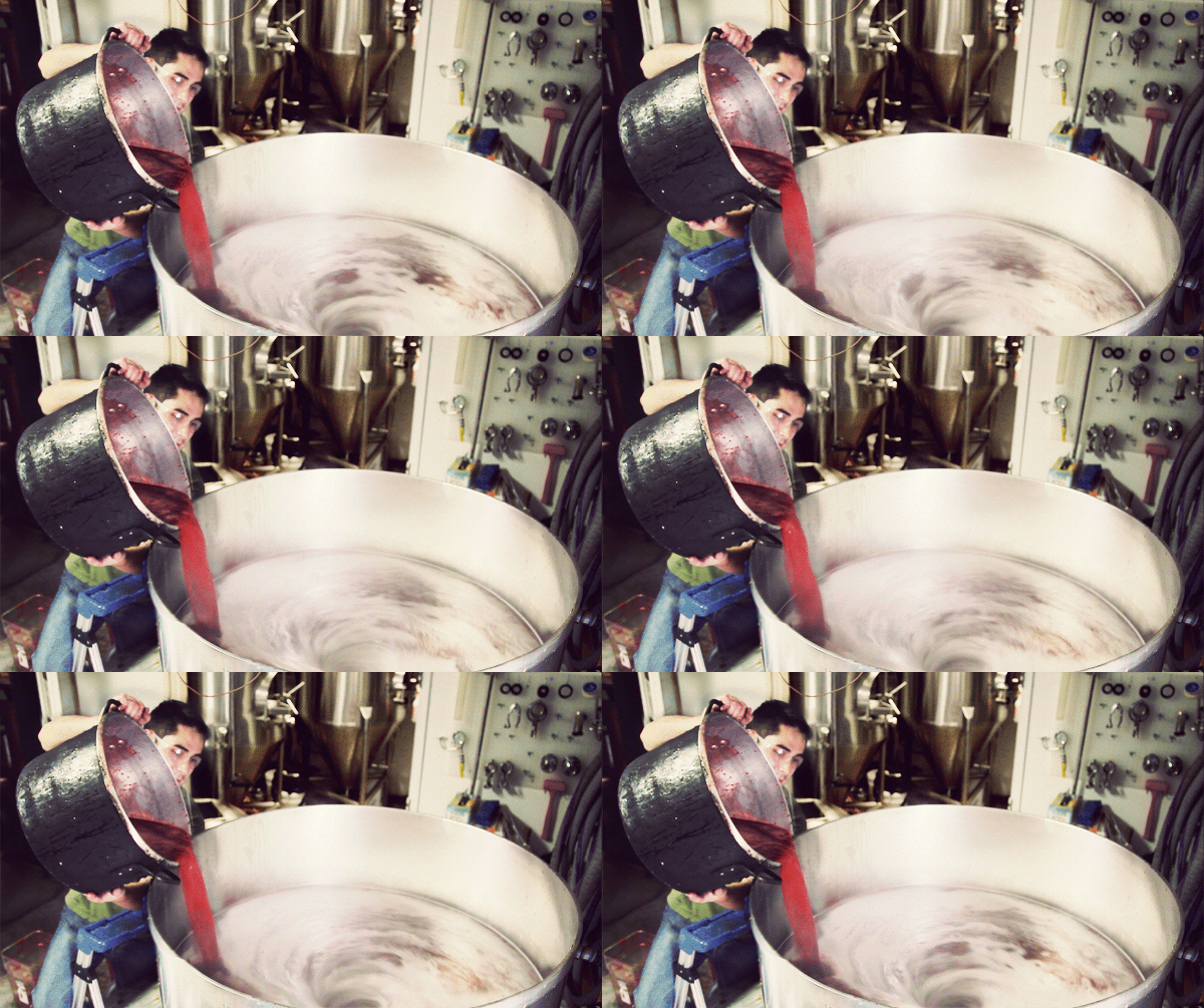
GIFs are very informative: you can demonstrate your product in action or show how it is created. At the same time, GIFs are short, load fast, and don’t bother customers with sound.
Check out a


4. Interactive Images
Everyone likes before and after pictures. They allow potential customers to see the result your product delivers.
Check out Benefitcosmetics.com. The picture is divided into two parts, and you can slide the ruler to either side to see how the
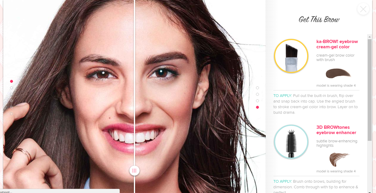
When you click on the product name, you are taken to the product page, from which you can easily make the purchase.
Here are some tools that play with interactive images:
- Thinglink helps to make images, videos, or 360°/VR content interactive. You can use it to add tags, sounds, and links. They offer a
14-day free trial. - Draw Attention is a free WordPress plugin that lets you create clickable highlighted areas on your pictures. It is perfect for showcasing new collections or product features.
- Visme is a great tool that helps you create interactive content and embed it into your website. Here’s a quick example (click on the categories to go to the Ecwid demo store):
5. Constructor
Constructor will let customers build the product of their dreams on your website. If you sell bikes like Myownbike.de, try allowing customers to choose the color, seat type, wheels, and other parts.
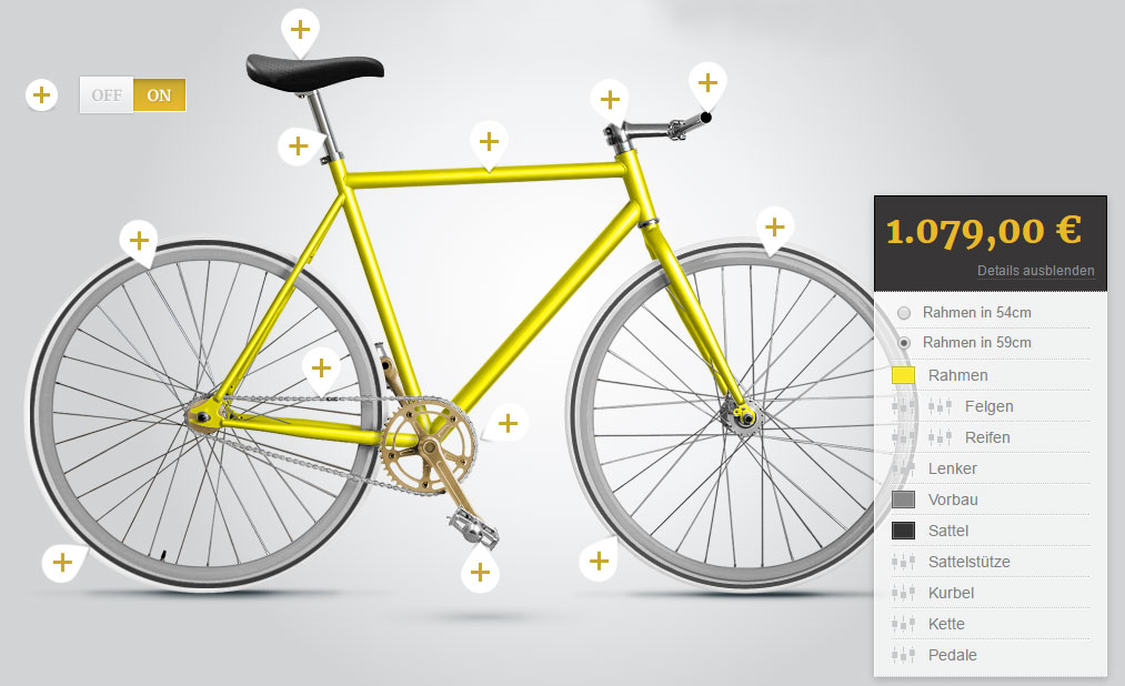
This is an advanced option that may require a developer, but if you are brave enough to try it, you will amaze your customers.
6. Defile
Defile is a great way to showcase clothes from every angle and demonstrate how a piece of clothing behaves when you move. Shoot short videos and add them to your product descriptions, like Asos.com does.
You can add video files in the product description section:

7. Video Reviews
This method is more
Check out a couple of ideas here:
Theory11.com sells accessories for magicians and shoots amazing videos about tricks performed with their products.
Bottlecutting.com made a
Flowmovement.net shot a workout video with models wearing their apparel.
Learn more here: How to Sell Using YouTube: A
***
Hopefully, these ideas inspire you to experiment and add a fresh look to your store!
- How to Fix Your Store’s Navigation
- Everything You Need to Know About Product Merchandising
- Online Merchandising: How to Layout Products in Online Store
- What is Fashion Merchandising, and Why Is It So Important?
- 10 Design Mistakes of Online Stores
- 15 Perfect Font Pairings for Your Ecommerce Website
- Color Theory: Everything You Need to Know about Color Themes
- 7 Creative Ideas for Your Ecommerce Product Page
- The Power of a Hero Image in Web Design
Must-Have UX Principles to Follow in an Online Store- Website Design Audit
- Unlocking the Power of UX Design for Ecommerce
- What’s the Difference Between UI and UX in Ecommerce?


