With Ecwid, you can add a store to your website, social media page, to marketplaces like Amazon
We call it Instant Site. It comes in handy for those looking to establish a web presence. With the help of an intuitive editor, it’s possible to create a website with no coding and in no time.
Instant Site is based on customizable blocks that you can design to tell your business’s story. If you want to explore all the Instant Site opportunities, this guide will walk you through setting up your ecommerce website step by step.
To begin, log into your Ecwid Control Panel and go to Sales Channels → Instant Site. Then click on the “Edit Instant Site” button — here we go.
Cover Image
Our brain gets 90% of all the information in a visual form.
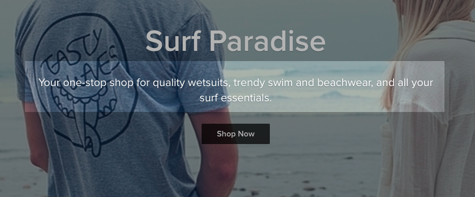
A stunning cover picture will tell your visitors where they are and spark their interest in your store in a second.

Ecwid Starter Site Demo
It’s a win if your cover image represents your product in action. If it’s hard to showcase your product (for example, because you sell
Look for a
high-resolution image starting from 1200 px wide for your cover image.
When you’re choosing your cover image, make sure that your title doesn’t fully cover your product’s important details and that it’s a clear image.
Learn more about beautiful product photography here: How to Take Great Photos for Your Online Store
Title
Eventually, it’s up to you to decide what exactly it should say. It might be a brand name only, or it might not contain a brand name at all. In any case, the title should help the visitor understand if they are in the right place.

Make it actionable and
Subtitle
The subtitle is the best place for a punchline, or in ecommerce terms, the unique selling proposition. It serves to help your customers understand what you offer and how it’s different from the others.
It’s okay to take advantage of two or three lines of text here if they can convince the visitors it’s the best place to buy what they came for.

Learn more: How to Create a Strong Unique Selling Proposition for Your Online Store
Your Logo
First of all, get one. It’s a big investment in making your business recognizable. There are at least six ways to get a logo, from free to professional and expensive.
Learn more: How To Create An Awesome Logo For Your Brand
The best size for a
retina-ready logo picture on a Instant Site is 600×600 px.
Make sure you’ve protected your brand and the logo is not only unique but also safe.

Storefront
There is so much to be said about creating a beautiful storefront. The minimum effort consists of these steps:
- Creating beautiful and converting product categories
- Uploading
high-quality product pictures - Writing outstanding product descriptions
- Creating smart product options
- Pricing the products

Pro tip: Ecwid’s Instant Site is the perfect fit for a landing page on which you want to sell just one product (or test your new products).
Why Choose Us Section
Just like in the subtitle, you need to add personality to your ecommerce website, but in more detail.

What can put a business forward, apart from low prices and high quality?
Think about your business processes and write down a list of advantages at every step. For example, you:
- Use local and organic materials
- Deliver the same day
- Offer
home-made exclusives - Allow deep order customization
- Have the widest range of colors in the market, etc.
Pro tip: Be specific. Compare these two statements:
- We
offer a high-quality product. - Our product is made of certified, organic, raw materials from Georgia.
Everyone hears and sees a lot of marketing phrases these days like “high quality”, “low prices”, “fast delivery”, and “best service” — and they are usually discarded as nothing but a buzz.
Just like in any other case, it’s much more effective to use proof instead of buzzwords in this section.
Testimonials
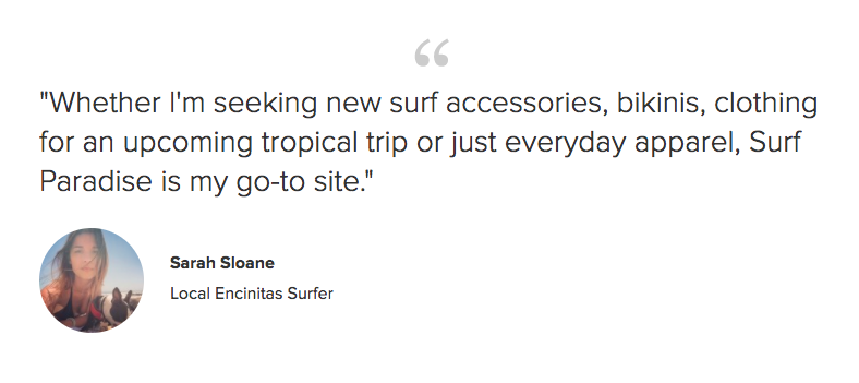
The majority of online shoppers consider customer feedback as a social proof.

Excited by the coming launch of their own business, sellers might compose a dozen reviews to be on the safe side. They often neglect how good people are at recognizing fake reviews. Some customers wouldn’t be impressed enough to buy; others would leave the store to look for a more honest seller.
So rule #1 is: publish real feedback. Friends and relatives might be able to help, but make sure they stay honest and say more than empty exclamations like “cool, awesome product!”.
You can also get feedback from the comments section on the Product Details page.
If there’s no feedback yet, you can simply hide this block or add your own quote to get even more personal with your visitors.
Just don’t forget to replace the stock picture that is provided as an example!
Related: How to Collect Customer Feedback and Use It to Build Trust
About Us Section
This section especially matters for startups.
If someone from the press enters your website and eventually gets interested in your product, your “About Us” section will serve as a short interview. Depending on how much this part impressed the reporters, they might contact you to make a sensation out of it.

Here’s what Kaleigh Moore, a professional copywriter, says about this section:
Beyond being a place to educate and inform curious shoppers, it’s often the first step toward establishing a relationship with new customers. Think of it as the place where you get to introduce yourself as the face behind the brand for the very first time.
Read more tips on writing an “about us” page like a copywriter in her post: How to Write an “About Us” Page if You’re Not a Copywriter
For the store owner picture, use an image of 512×512 px. Pictures with one person are the best because they can’t confuse the visitors.
Location
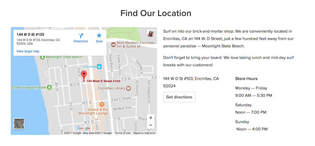
“Why add a physical address on the map if you sell online?” — you may ask. Here’s the answer.
Many businesses use Ecwid’s Instant Site to launch their first online store. That means they haven’t got any seller’s reputation at that time. Displaying a physical address demonstrates the reliability of the store owner. Also, it may be the address for returns, refunds, or

You can hide the address section if you feel it’s not relevant to your business.
Contact Details
Don’t forget to add your contact info and set up social buttons: change links to your business profiles and save the changes. Otherwise, your customers won’t be able to follow you on social media and they might forget about your store.

Add your phone number and it will appear on the top of your ecommerce website (above the fold) together with the links to your physical address and business hours (if you fill and enable those sections).

Your Store URL
By default, the name of your Instant Site will look something like this: store12345.ecwid.com.
Instead of 12345, it will contain your own store ID. That says nothing to your potential customers. You can replace your store ID with the actual store name, e.g. goodbooks.ecwid.com. That will make the link more recognizable,
It’s also possible to connect your Instant Site with a custom domain name (e.g. goodbooks.com) on paid plans.
You can make all the necessary changes to your store URL address in Control Panel → Settings → General → Store Location.
Note: Apps for customizing your storefront like Promo Bar, Coupon Popup, and more, are compatible with Instant Site too. Don’t forget to have a look at the Ecwid App Market to extend the functionality of your Instant Site.
That is basically it
Share links to your Instant Sites in the comments, and I’ll be happy to give advice.
***
Looking for more ways to sell online? Read these posts:
- How To Add an Online Store to Your Existing Website
- How To Open An Online Shop on Facebook
- How to Sell on Marketplaces With Ecwid
- Сomplement Your Ecwid Shop with a Mobile App
- Selling With Ecwid “Buy Now” Button
Or, and have a look at Ecwid 101 to get the idea of the ways to sell with Ecwid.
- Inspiring Ecwid Instant Site Examples
- Ecwid Instant Site With Ready Themes and 99+ Design Options
- New Ecwid Design Settings: Dozens of Customization Options, No Coding
- How to Choose an Ecommerce Template for Your Site
- A Comprehensive Guide to Customizing Your Ecwid Store Design
- Designing Your Ecommerce Website From Scratch
- How Ecwid’s Accessible Online Store Template Became a Hit


