Users tend to make quick judgments about a website’s credibility, professionalism, and relevance based on its visual appearance. Clicking off a
In the
One of the first things that visitors see when they land on a website, and one of the primary factors that catch their attention, is hero images. They are strategically and visually striking elements that communicate the brand’s identity.
In this post, we’ll explore the significance of hero images in web design, unraveling the secrets behind their allure and examining how they serve as a digital welcome mat to your brand’s online presence. Join us as we dive into the art and science behind hero images.
What Is a Hero Image In Web Design?
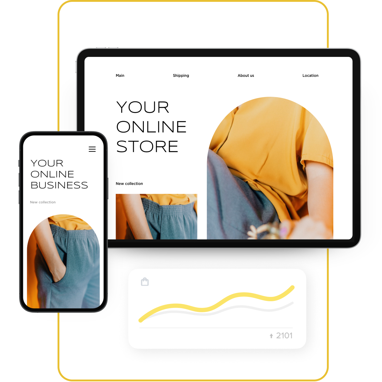
In web design, a hero image is the first photo, graphic, illustration, or video people see on a web page.
This isn’t just a pretty picture; it’s a crucial component of web design that instantly communicates a brand’s identity, message, or purpose. Hero images are typically positioned at the top of a webpage, making them immediately visible on the site.
A wide range of websites, such as blogs, landing pages, ecommerce platforms, and commercial and corporate websites, use hero photos. Their ability to draw in people and efficiently communicate essential ideas is enhanced by their
What’s The Primary Purpose Behind Hero Images?
Think hero images are just about aesthetics? Think again!
More than a pretty picture to add some form of visual to the page, the primary purpose of a hero image is to grab the viewer’s attention. It is often a
With the increasing use of mobile devices, hero images are designed to be responsive, adapting to different screen sizes to ensure a consistent and visually appealing experience across various devices.
Hero images often have text or other content overlaid on them despite their strong visual appeal alone. This text can be a headline, subheading, or supplementary language that gives viewers context or directs them to particular areas of the website.

An example of a hero image that has text and CTA. More inspiring hero image examples are here.
Last but not least, Hero images often have a call to action, urging viewers to perform a certain action. This can be anything from “Learn More” to “ Shop Now.”
Hero Images Examples
Hero images in web design convey brand identity, set the tone, and capture attention instantly. Let’s have a quick look at how top websites master the art of hero images. In the next section, we’ll be exploring a curated collection of hero image examples across various industries, showcasing the diverse and impactful ways they enhance user experience. Keep reading as we unveil the strategies that make these visuals genuinely irresistible!
Fashion: Zara

Zara incorporates hero images to display their latest fashion collections. These images often include models wearing the clothing in stylish settings, creating a visually appealing and aspirational look.
Food and Culinary: Food Network

Food Network’s website uses hero images that showcase delicious dishes. These images are vibrant and enticing, encouraging visitors to explore recipes and culinary content.
Non-profit: World Wildlife Fund (WWF)

The WWF often employs hero images featuring endangered species or natural landscapes, creating an emotional connection with visitors. These visuals convey the urgency of conservation efforts.
Finance: Mint
![]()
Mint, a personal finance app, uses hero images that depict individuals managing their finances effortlessly. The visuals communicate a sense of control and financial
Hero Image Dimensions
The dimensions for hero images can vary based on the design preferences of a website, the layout, and the specific requirements of the content management or theme being used.
Sizing a hero image can be confusing. Banner hero images aren’t the same as
While banner hero images typically span the full width of the content area or container area,
This is why finding the right aspect ratio and cropping can get confusing when sizing hero images. Here is some guidance to help you better scale common types of hero images. Keep in mind these are suggested sizes, and you may adjust them based on your specific design and platform:
Full-screen image dimension
- Width: The width of a
full-screen hero image is typically set to 100% of the viewport width, ensuring it spans the entire width of the user’s screen. - Height: The height of a
full-screen hero image is often set to 100% of the viewport height, creating a vertically immersive experience. The exact pixel dimensions can vary based on the aspect ratio and the design aesthetics.
Banner hero image dimension
- Width: Typically spans the full width of the content area or container. The width of a banner hero image spans the full width of the content area or container. This width can vary but is often around 1920 pixels for standard desktop displays.
- Height: The height of a banner hero image is usually more variable and can depend on the design aesthetics and the content you want to include. It’s common for banner hero images to be shorter in height compared to
full-screen images, often ranging from 300 to 600 pixels.
Mobile hero image dimension
- Width: For responsive design, it’s common to use a width of 100% to ensure the image adapts to the width of the mobile device’s screen. This allows the image to span the entire width of the viewport.
- Height: The height can vary, but it’s essential to consider the aspect ratio to prevent distortion. A good practice is to optimize for a visually pleasing and balanced appearance on mobile screens. Heights typically range from 200 to 600 pixels, depending on the specific design and content.
Overall, If your website relies heavily on text and information, a banner hero image may be more suitable. If you want to create a visually immersive experience or showcase stunning visuals, a
Common Mistakes When Adding Hero Images
Hero photos may effectively convey a brand’s message and improve a website’s visual attractiveness, but there are some typical mistakes web designers and developers make when using them. A website that is more successful and
- Large files: Adding
high-quality photos that are too big for your website may cause it to load more slowly. If it takes too long to load, users can become disinterested or quit the website. Optimize your photographs to get the best possible balance between resolution and size. - Unoptimizing for mobile: Hero images lacking responsive design may appear deformed or unattractive on smaller displays. To ensure a seamless user experience, make sure your hero photos work effectively on a variety of devices.
- Poor contrast with text: If the hero image contains busy or dark features, it may clash with overlaid text. Make sure the contrast is sufficient to enable easy reading of the text. Using text with a
semi-transparent background or adding text shadows can improve legibility. - Ignoring brand consistency: The hero image should align with the overall branding of the website. Using images that are inconsistent with the brand’s color scheme, tone, or style can confuse visitors and diminish the site’s professionalism.
- Neglecting page speed: Aside from picture file sizes, other variables that affect page speed include the quantity of HTTP requests made and the time it takes for a server to respond. Enhance the functionality of your website to guarantee a seamless user experience.
- Lack of relevance: The website’s content or goal should be addressed by the hero image. Visitors may become disoriented or lose interest if it doesn’t make a clear connection to the content of the website.
- Not testing across browsers: Different web browsers may interpret code and display images differently. Test your website across various browsers to ensure that your hero images appear as intended for all users.
From oversized file dimensions to slow loading times to poor contrast with text, each of these common mistakes can have a big impact on a visitor’s perception and engagement. Avoiding these common mistakes when implementing hero images is essential to ensure a positive user experience and an appealing website.
The aim is to strive for a delicate balance between aesthetics and functionality. Through strategic planning, testing, and a commitment to
Hero Images Best Practices
Don’t click away just yet as we get ready to share some insider tips for hero images that align seamlessly with your brand!
Similar to common mistakes, hero image best practices mostly involve effectively implementing certain practices to ensure your images of choice effectively contribute to a positive user experience. It basically comes down to the avoidance of common mistakes mentioned previously and some key guidelines mentioned in the next few sections.
Clear call to action
If including text or buttons on the hero image, make sure they are concise, compelling, and encourage users to take action. Use strong verbs to start your call to action, include words that provoke emotion or enthusiasm, take advantage of our natural fear of missing out, match your CTA to your device type, and ultimately maintain a good balance between visual elements and text.
Responsive design
Design hero images to be responsive, adapting seamlessly to different screen sizes and resolutions, including mobile devices and tablets. Don’t forget about typography also.
Focal point and composition
Place important elements (such as a logo or key message) strategically within the hero image to guide the viewer’s focus. Consider principles of composition like the rule of thirds.
Loading speed
Optimize images to minimize loading times. Users may leave if a website takes too long to load, impacting bounce rates and SEO.
Storytelling and emotion
Use hero images to tell a story or evoke emotions related to your brand or message. Create a connection with visitors through compelling visuals.
A/B testing
Experiment with different hero image variations to see which performs best. A/B testing hero images helps identify the most effective visuals for your audience.
By adhering to these practices, you can make the most of your hero images, increasing your site’s visual appearance and encouraging your visitors to stay longer. You can potentially enhance the overall user experience and contribute to the success of your website or store by strategically applying these elements of practice.
Hero Images for Website and Ecommerce Store Owners
Hero images can play a crucial role in capturing the attention of visitors and encouraging them to explore your products.
You can use hero images to showcase your skills on your web portfolio, as a way to give a background story for your nonprofit site, showcase the latest products or arrivals for your online store, and even as a way to highlight new items.
You can also tailor hero images to match seasonal campaigns or promotions, announce special offers or discounts, tell the story of your brand, showcase compelling calls to action, prompting visitors to take immediate action, and ultimately add a dynamic element to your page.
Remember to regularly update hero images to keep your website fresh and align visuals with ongoing promotions or seasonal changes. By leveraging compelling hero images, ecommerce store owners can create an immersive and visually appealing online shopping experience.
- How to Fix Your Store’s Navigation
- Everything You Need to Know About Product Merchandising
- Online Merchandising: How to Layout Products in Online Store
- What is Fashion Merchandising, and Why Is It So Important?
- 10 Design Mistakes of Online Stores
- 15 Perfect Font Pairings for Your Ecommerce Website
- Color Theory: Everything You Need to Know about Color Themes
- 7 Creative Ideas for Your Ecommerce Product Page
- The Power of a Hero Image in Web Design
Must-Have UX Principles to Follow in an Online Store- Website Design Audit
- Unlocking the Power of UX Design for Ecommerce
- What’s the Difference Between UI and UX in Ecommerce?


