When you’re looking to promote your business on social media, Instagram ranks high on the list. Why? Instagram is an entirely visual medium and nothing works better for an online business than visuals. Random browsers turn into potential customers based on the credibility of your product images.
How does Instagram help in this regard? Instagram lets you develop a brand aesthetic that increases your engagement and drives traffic to your store. Also, you can use product tagging to start selling directly on Instagram.
A lot of this depends on how you design the look and feel of your Instagram business account. When someone comes across your profile you want them to stay back and “follow” you. Your overall Instagram feed should be visually consistent to generate interest.
While a themed Instagram requires planning, it’s not that hard if you start by shortlisting what you want your business account to reflect.
1. Draw inspiration from your favorite feeds
Assess all your favorite Instagram accounts. What do like about each one of them? Is there anything that stands out for you? Make a list of the things that appeal to you about each account.
I like how Adobe’s account puts up

And AirBnB posts images of their best BnBs from across the globe. The images are so stunning, they would turn even the most random lurker into a customer. I’m inspired to try different angles from looking at their feed.

2. Play with colors
This is one of the most common ways to go about a themed Instagram account.
You can stick to one color and have it repeated in various ways through the objects in your images. ihavethisthingwithpink’s entire feed is curated in the obvious — pink.

Lifestyle photographer, Dylan Furst’s Fursty doesn’t have such an obvious color choice, but the entire feed has a tinge of blue and green. The photos are all natural, but they blend in with the overall color scheme.

For cestmaria, the Instagram account of photographer and interior stylist Maria Marie, the theme color changes with the seasons. The consistent color is always in the background, while the foreground is in soft pastels.


If you’re the experimental kind, you can change the color theme in every row. For instance, as a seller, you can post 3 products of the same color in one row, then change to another product color in the next row. When looking at your overall feed, this kind of an arrangement will make each row pop out.
3. Try the checkerboard
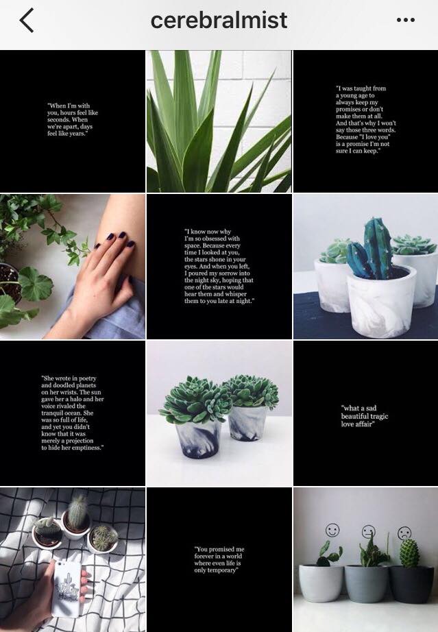
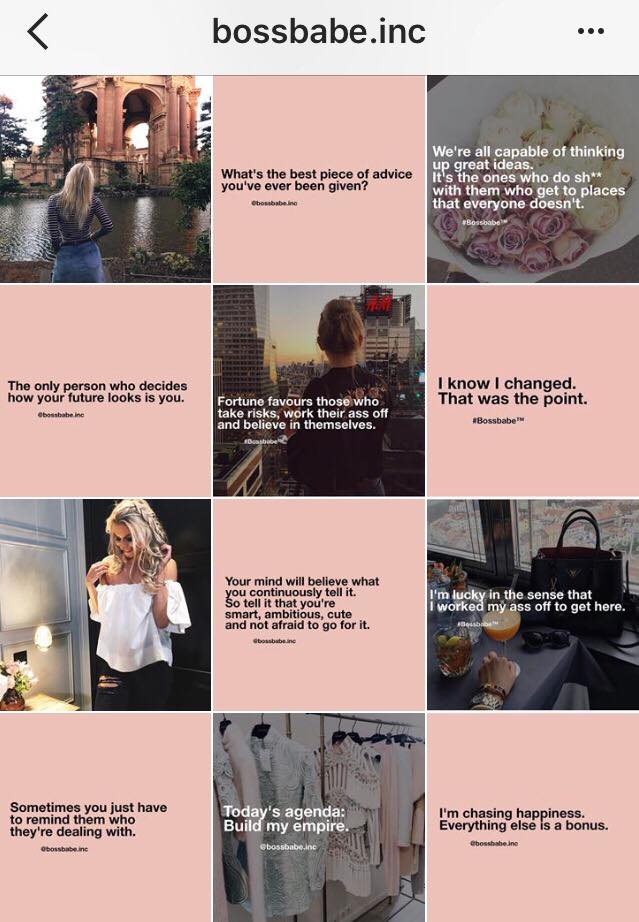
The checkerboard theme isn’t just classy to look at, it is also very effective in increasing engagement. In this feed, every alternate photo has a consistent background. Most users alternate between photo and text, but many others also alternate between two different background colors.


This is a great engagement builder because you can alternate your product promotions with inspirational quotes, facts or personal photos. A good mix of content helps in not coming across as spammy and makes browsers stay back for both entertainment and information.
4. Experiment with borders
The rebel in you may want to go against Instagram’s square photo grid by changing the aspect ratio of your photographs.
There are a number of things you can do with borders:
The white border: This is the most commonly used border. The most aesthetically appealing way to use this is to crop your photos horizontally and add border bars on the top and bottom. It immediately lends a classic and professional feel to the feed.

You can also use the white border in square and vertical images and mix it all up. The disjointed look is quirky like you will see on the.avantguardian’s feed below.
The black border: This will immediately make your feed stand out because the black border is rarely used. However, ensure that the black border theme goes with the whole mood of your business page.
I like how the.avantguardian does not restrict herself to one particular border. Her overall theme is a mix of both black and white borders and is immensely attractive.


The circle frame: This is also fairly uncommon, and as a seller, might restrict the kind of product photos you can post because a lot of it gets minimized in the circular frame, but it is still visually an interesting thing to try. And, as with the others, you can mix it up with other frames and borders.


Some of the apps that let you make these borders and more, are:
5. Choose your mood
This requires a good amount of thinking. What will be the content strategy for your business page? And what mood should that reflect?
For instance, if you are a home decor seller, the white minimalistic approach is elegant and artsy.


If you’re a portrait or still life artist or photographer, you could try a moodier, darker tone.


Keep in mind, that your mood must reflect the vibe of your product. If you sell swimwear, the vibe will be neither minimalistic nor dark hues, but beachy and vibrant. It is important to plan out the “mood” depiction of your business page before you start posting.
6. Stick to a filter
Trying only a particular color or border or mood for your Instagram tends to restrict the kind of images you can post. An easier way to maintain a cohesive theme for your feed is to use only one kind of filter. If you’re changing up the sharpness, contrast, and brightness, use the same presets for all your photos. This will make your images flow into each other smoothly, irrespective of the subject.
If there’s a photo that doesn’t fit into your designated filter but you still want to post it, go ahead and do that, too. Just make sure you go back to your theme for the next few photos.


Not sure which filter to use? Pinterest has a host of ideas to offer on choosing Instagram feeds.
Popular filter apps to use:
- VSCO Cam
- A Colour Story
- Afterlight
- Lightroom
Pro tip: If you’re using the OrangeTwig app for your social media marketing, you can also edit your photos and change filters to fit your theme.

Or you can choose layouts with a similar theme to showcase your products in. Since these are


Learn more about OrangeTwig here.
7. Break the grid rule
This theme element has been taking over Instagram like a storm. It’s no longer about fitting one photo into one grid.
Imagine a row of grids that make up just one big picture. Instagrids does just that. It lets you break up your photos into 3 part grids or 6 part grids or 9 part grids, whichever you decide to go with.
While this is aesthetically very pleasing, you need to post all the grid parts at the same time to get the look. You will also need to always post your images in groups of 3 so you don’t disrupt the big image.


Other apps that let you make many part grids:
- Tile Pic
- Pic Slit
A few things to note
- Good photography is everything. Chuck images that are blurry or grainy. High resolution pictures should be your priority.
- Play with composition, color palettes, patterns.
- Try interesting angles — low angles, front angles, flatlays (high angles).
- Make use of negative space.
- Don’t spam your feed with just promotional posts, but don’t forget your subject. Keeping a theme is about portraying a recognisable universe within the context of your business profile, without being boring.


A word of advice
You may be curious to try out all the themes at once or maybe even just one of the themes, but before you begin, do make sure that what you choose goes along with your brand aesthetic. Ask yourself the following questions:
- What does my brand stand for?
- Will this theme add to my brand value?
Maintaining Instagram themes takes a lot of time and effort. When you do start developing one for your business profile, you should be clear about what you’re aiming for.
Instagram is one of the best social media channels for marketing. Make the best use of it and get your brand name out there. Happy marketing!
- How to Sell on Instagram: Complete Guide for Beginners
- How to Use Instagram for Business: Tools and Proven Practices
- How to Get Approved for Instagram Shopping
- How to Sell on Instagram Without a Website
- 10 Engaging Instagram Reels Ideas to Promote Your Business
- Easy Steps to Organize your Instagram Profile for Business
- How to Develop a Visual Theme for Your Instagram Business Profile
- 8 Photography Tips for a Stunning Instagram Business Profile
- Instagram Stories 360: All Business Owners Need to Know
- Threads for Businesses Explained
- What to Post on Threads for Businesses: 10 Ideas


