Design speaks volumes for an
Ecwid helps any business — even a small and beginning one — to look and sell professionally on the web. You don’t have to pay an awful lot to
We’ve added dozens of new storefront design functionalities to Ecwid, so that you can give your
Setting up every little detail in your online store design is dead easy. Change image styles, product page layouts, and storefront elements without coding. You’ll see it for yourself in this post.
The new settings nest under Settings → Design in your Ecwid Control panel. To use them, make sure you’ve enabled all the storefront updates in Settings → What’s New.

Enable these updates in Settings → What’s New to see the new design settings page
What if I’m using the older version of Ecwid storefront?
Switching to the new storefront may change the look of your store completely. With the new design settings, you’ll get more customization options and a more compelling look for your store. However, be careful if you’re using a
Design Your Online Storefront
You control the entire look of your product catalog, from product pictures to SKUs and buttons.
1. Сhoose the best image size to showcase your products
By default, product images are
Some products have important details that you might want to visualize (for example, if you sell jewelry or paintings). Select the large image size to let your customers admire your beautiful products and photography.
If you sell one product type in a large assortment (say, 200 leather belts in different colors), stick to smaller images. Your store will display a lot of products on the screen and your customers will be impressed by the choice.
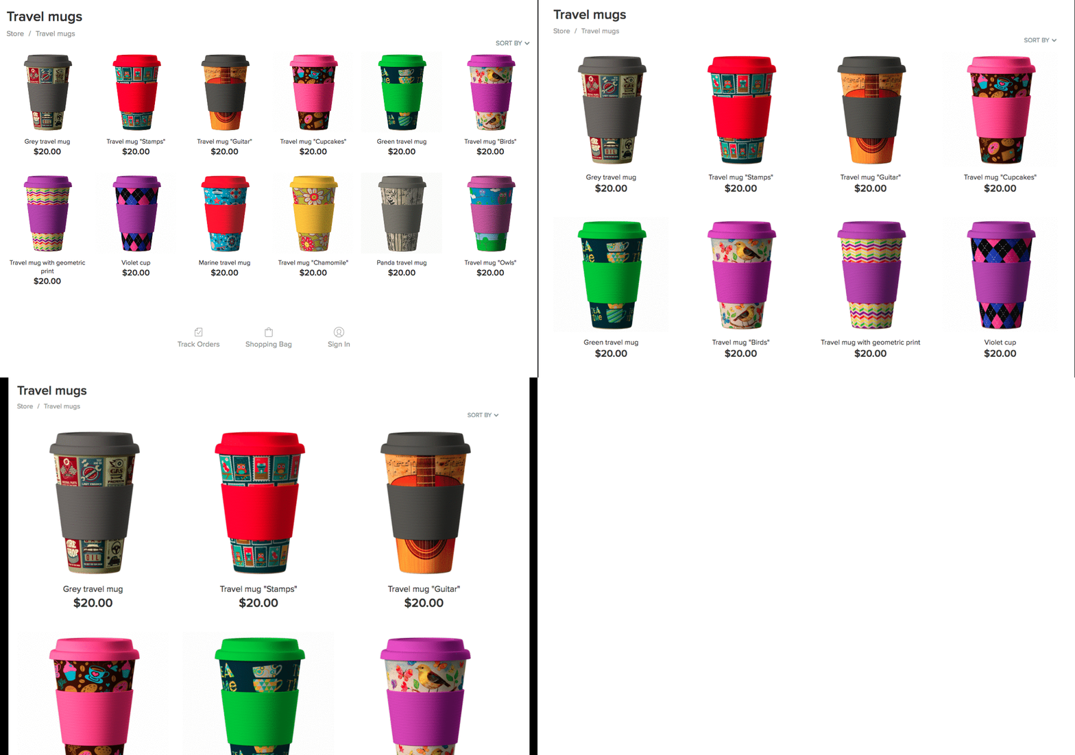
Small, medium, and large image size for product pictures
2. Optimize image aspect ratio to your product dimensions
Do you sell palms? Or maybe
The horizontal ratio suits wide products — say, shoes, sofas, or nutrition bars.
For round objects (or, when in doubt), use square images, they always look great.
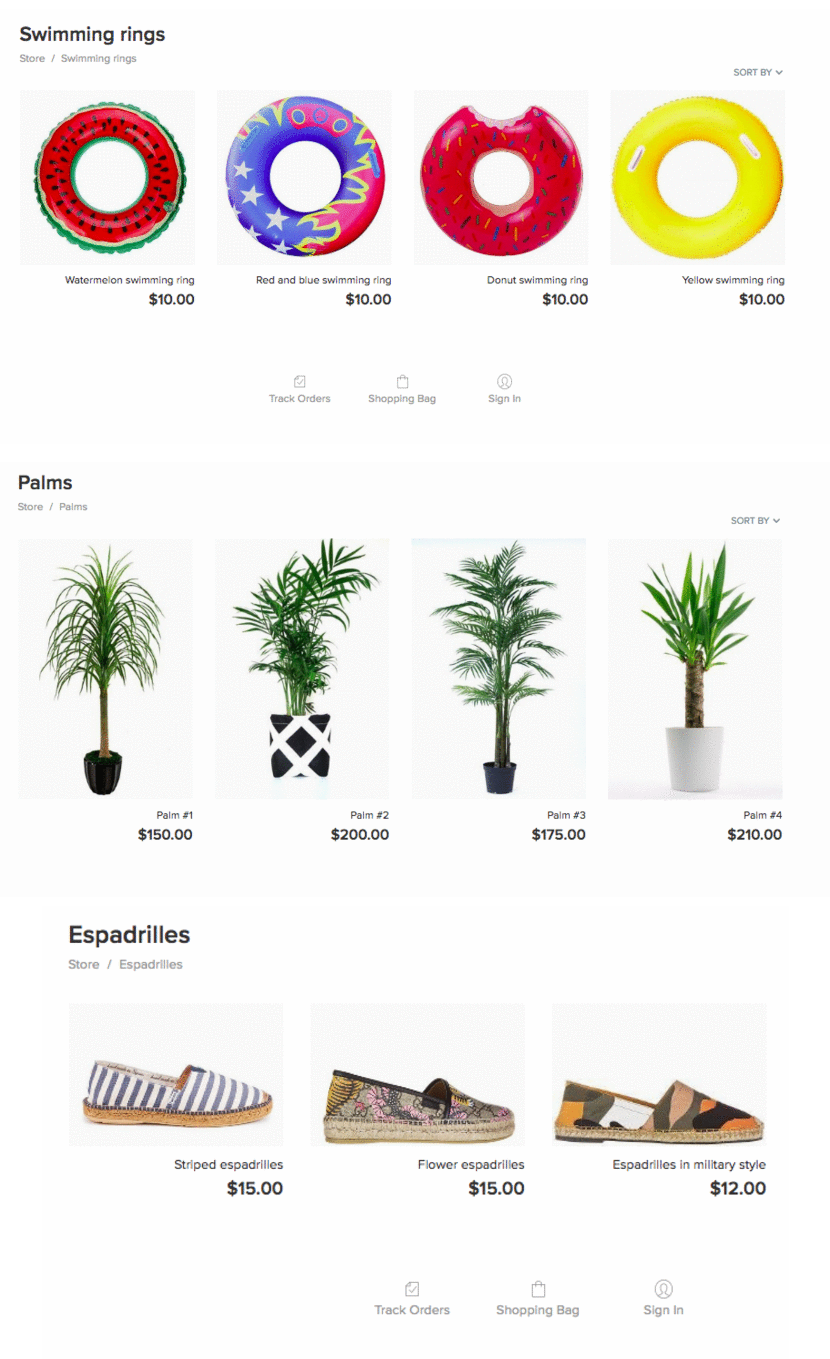
Vertical, horizontal, and square images
If you want to emphasize product images and make them stand out from the store background, select “Darken image background”.
3. Choose what product info to show in the storefront
Similar to product photos, you can choose from many design options for other storefront elements: product names, titles, prices, SKUs, “Buy” buttons. Decide how to display each of them — under the product image or on mouse hover.
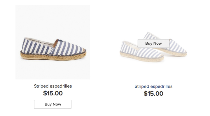
Display the elements under product pictures, on hover, or hide them
If you choose to place the info under the product pictures, it’s possible to set the layout. Align your content to the left, right, center, or justify it
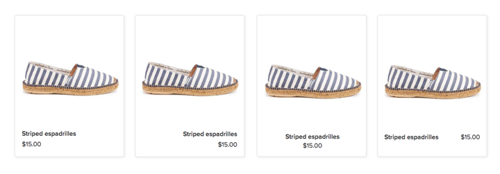
Different layouts of the elements (product name and price)
It’s also possible to hide elements. Hide all of them to make your storefront resemble a lookbook. By clicking any of the product pictures, your customers will go to the product page.
Choose to display an additional product image if you want to show more details. Ecwid will show the first image from the product photo gallery on mouse hover.
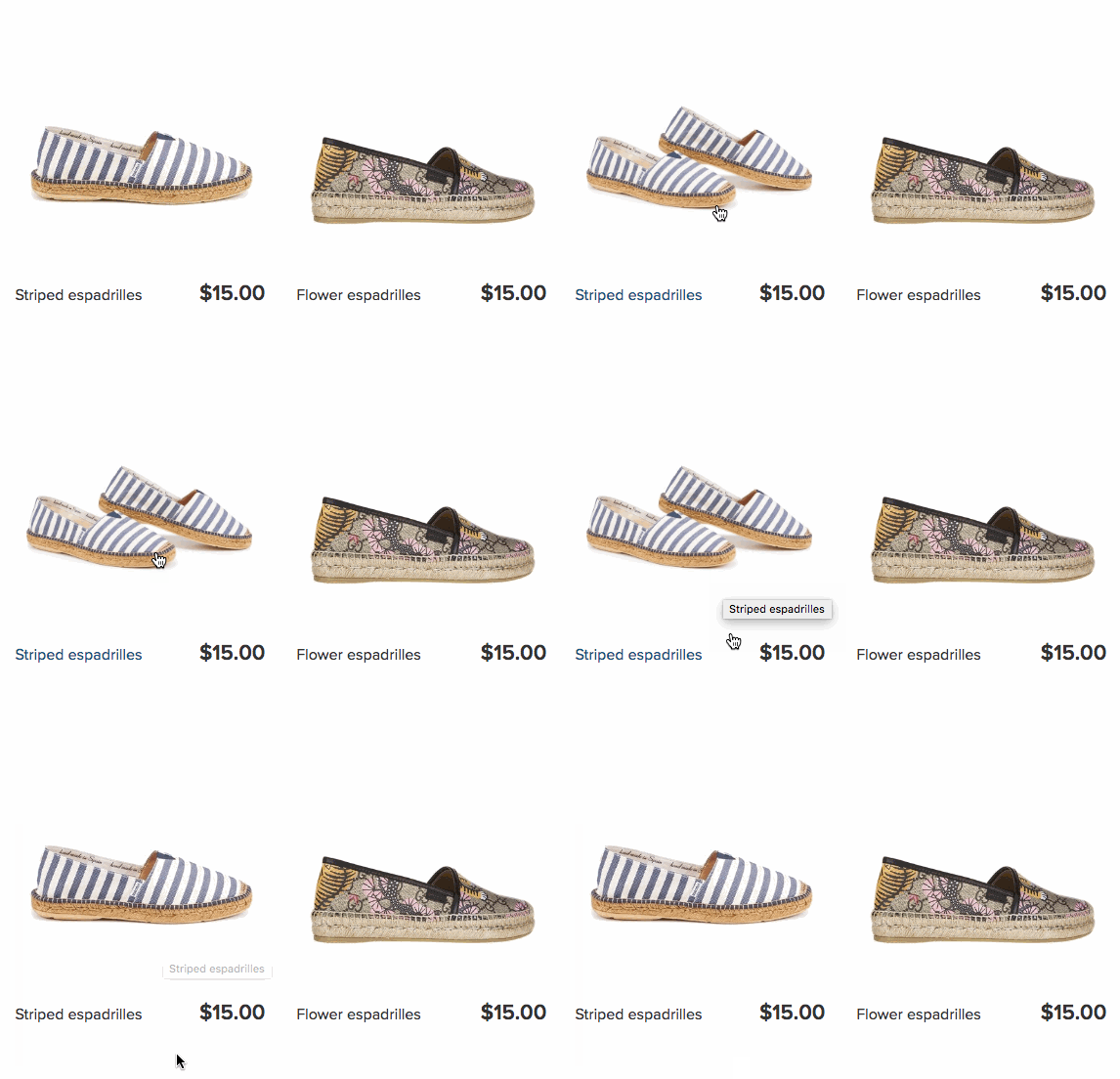
Additional product image on mouse hover
These new settings make for a great number of design variations for your storefront look.
4. Design your store categories
You’ll find options to set up the look of your categories. Whether you have photos, icons, or brand logos for your category pictures, Ecwid has design options to make them look stunning.
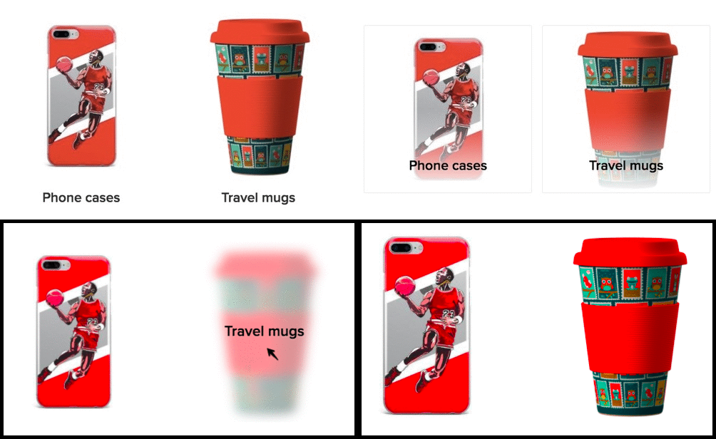
Category names under pictures, on them, on hover, and hidden
Optimize Product Pages for Conversion
Now you can organize the information of your product pages in different ways, depending on what works best for your customers. Each design option is made according to the best
1. Choose the product page layout
There are four new options for organizing content on your product pages.
Attract attention to your product pictures. Placing a
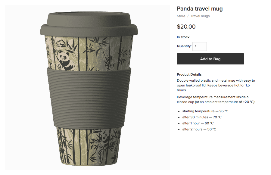
The
Add detailed product descriptions. For products like electronics or pharmaceutical goods, product descriptions can be pretty long. Then select the
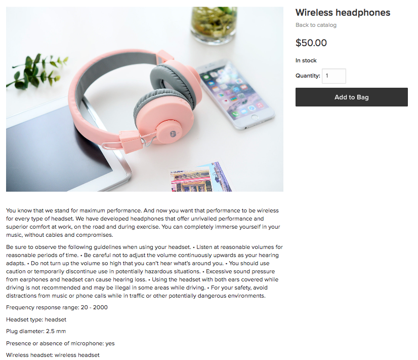
The
Emphasize product options and the “Checkout” button. If your customers don’t have to read long descriptions or scrutinize the gallery to buy your products, choose to show the product options with the checkout button on the left. Say, if you sell tiny aquarium fish.
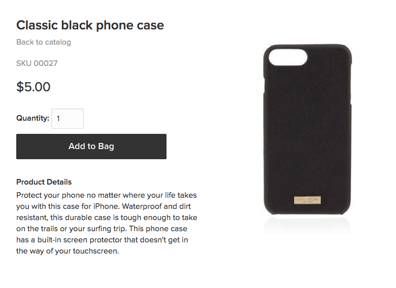
The “Add to bag” button in focus
Minimize scrolling and distraction. A

The compact
You can also select the layout of your photo gallery. Help your customers get the feel of your product with a compelling photo gallery. Choose the layout for thumbnails of images in your gallery (vertical or horizontal) or show your hypnotizing images in full size. The more alternated and detailed views you show, the better.
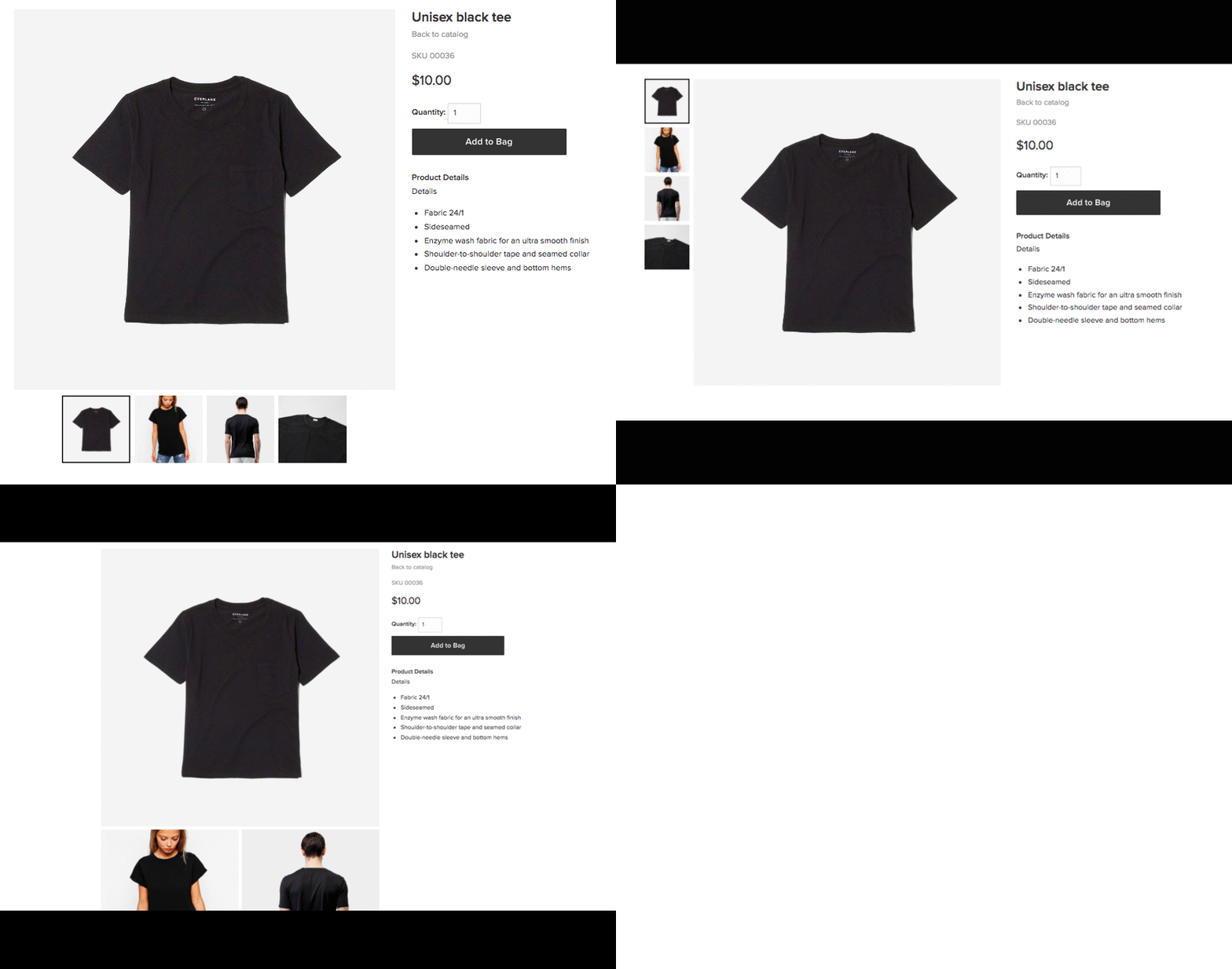
Photo gallery layout options
3. Select the product info to display in the sidebar
A converting product page provides enough product information while keeping it simple. In Ecwid, you can hide the elements (like SKU, product options, share buttons) if you don’t need them, so that your customers don’t get distracted on their way to cart.
The best part is that you can drag each element and organize them in any order. Test lots of new ways to optimize your product pages for conversions.
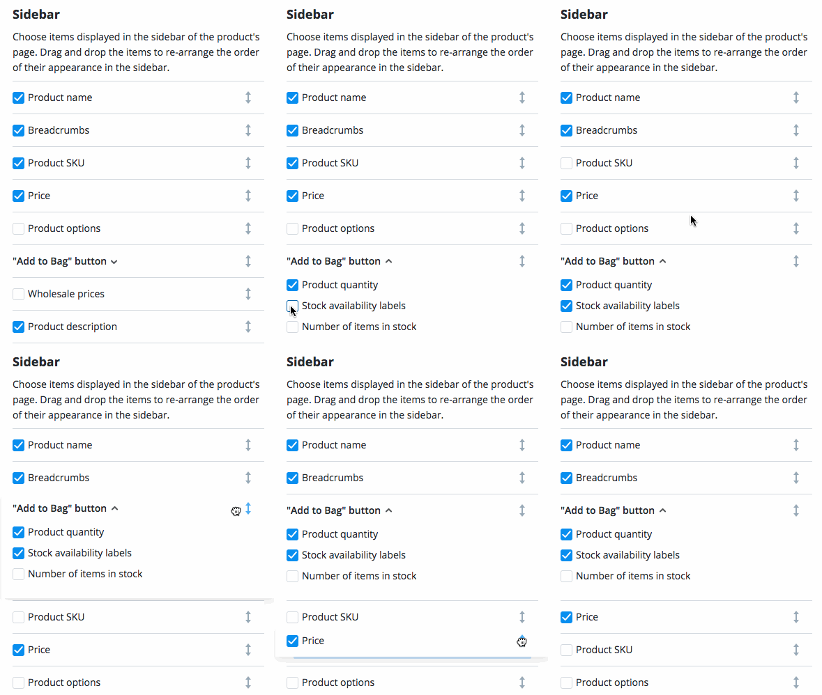
Flexible sidebar settings
Change Your Storefront Navigation & Colors
There are a few more storefront settings, which are enabled by default to help your customers navigate your store. You can turn any of them off whenever you like.
If you switch from the older storefront version, these settings will migrate to the new storefront as you had them before.
Color Adaptive Mode. If you install an Ecwid online store on your website, the store colors will automatically match your website theme. Your store will look like a natural part of your website.
The footer menu and breadcrumbs help customers to browse your store faster and prevent them from getting lost.
The
“Sort by” options allow your customers to sort your products by price, name, and other conditions.
Other Ways to Change Your Ecwid Store Design
The new design settings cover the most common use cases. If you would like to change your store in other ways:
- If you need a custom theme for your store without coding, try design apps from the Ecwid App Market (available on paid Ecwid plans, app prices apply).
- Create a custom CSS theme (a set of rules that determines the look of every element in the store, like the size, shape, or color). Creating a CSS theme requires certain tech knowledge. There is a guide to CSS themes in the Ecwid Knowledge Base that explains how to create your own CSS theme and instructions for changing specific elements. You can always ask the Ecwid customer care team for help, or order the custom development of your own CSS theme.
- For developers: Use the Ecwid Javascript API to extend Ecwid storefront features. You can build a new CSS theme or an app, and sell it on the Ecwid App Market. The Ecwid Javascript API allows you to change the storefront look completely, bringing changes as deep as you need. If you are ready to start, please register on our page for developers.
Get a Website for Your Business
Your Ecwid store looks great, but you don’t have a website to sell on?
Instant Site is a website builder that Ecwid provides when you create your Ecwid account. This is done to let you quickly start selling online on a neat web page and make profits right away to grow your business.
Speaking of design, Instant Site is built with
If you need to customize your Instant Site, who’re you gonna call? Well, no one! You can edit the entire website without special knowledge, using your desktop computer or even via the Ecwid Mobile store management app for iOS.
Build your Instant Site today using our
- Inspiring Ecwid Instant Site Examples
- Ecwid Instant Site With Ready Themes and 99+ Design Options
- New Ecwid Design Settings: Dozens of Customization Options, No Coding
- How to Choose an Ecommerce Template for Your Site
- A Comprehensive Guide to Customizing Your Ecwid Store Design
- Designing Your Ecommerce Website From Scratch
- How Ecwid’s Accessible Online Store Template Became a Hit


